The function/ purpose of this magazine are to entertain the audience. The cover is used to persuade the audience into buying this magazine out of the rest of the magazines.
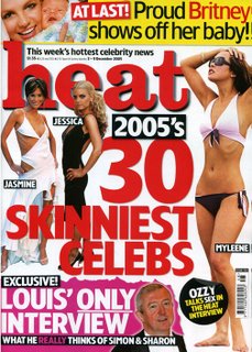
Heat is a magazine that reaches a mainstream audience. This means that is it a successful as a result it reaches a wide audience. To attract and persuade these audiences, the colours used are very bright and stand out for the magazine. These colours include red, black and yellow. The colours make the article titles stand out from other magazines as a result makes the audience want to read this magazine rather than other magazines that are similar. Red is the dominant colour used on the magazine cover. This could connote fire and this links with the masthead of the magazine, heat. As heat is hot and is represented by the colour of red, the colour suits the masthead and this can be identified by the readers. The typography used on the front cover is a bold font. This makes the writing on the cover stand out as a result it can be seen clearly by the audience for far away. This would attract wide range of audiences as it stand out getting easily noticed.
The background colour is white; this makes the red stand out more. The reason they would want the main article to stand out is because this is what will bring in the audience so it need to stand out so they can tell it apart from other magazines. On the front cover, beside the title are 3 women who will be in the actual article inside the magazine. The reason they did this is so the readers are given examples of what is going to be included.
The puff is on top of the masthead. It reads ‘this week’s hottest celebrity news’. The word hottest is used to in the puff and this links with the masthead-heat. Heat is hot and they created humour out if it as well, this makes the audience feel involved.
At the bottom it says excusive, this means that they have an article that only they could get. This would persuade the audience to buy it because it creates enigma and the enigma is only resolved if they buy the magazine. Only is underlines and it’s like a privilege reading it as he’s only done one interview and for heat magazine. This will give the audience the impression that heat is a good magazine and as a result give t a good impression with the public. Underneath that it says really in a different colour to the rest of the sentence. This means it’s a gossip interview as a result would persuade the audience to read it.
At the top, there is an article of Britney and her son. It catches the reader’s eye because they have her smiling next to her child who looks so cute, this would make the audience want to read it. Britney is written in red, a colour that stands out as a result it catches the audience’s attention. It’s at the top of that page and near the masthead as a result people will notice it clearly. The image is telling the audience that she want to share her joys with everyone else creating identification and involvement. She is also creating a good image for mothers as she is posing with her son, smiling.
In conclusion, a variety of features are used to persuade the audience to buy the magazine using colours and fonts to pictures.
posted by Charlies Angels-Full Throttle at 12:06 pm
![]()

0 Comments:
Post a Comment
<< Home